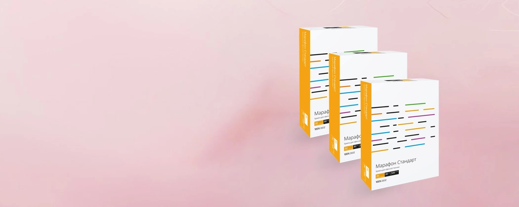
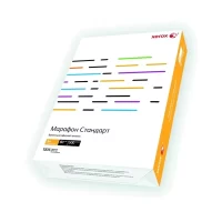


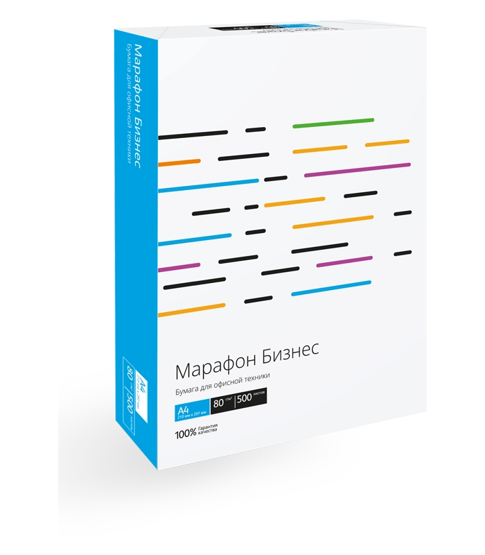
Мега-акция на бумагу Марафон: Ваши покупки превращаются в сертификаты!
Запаситесь бумагой и получите больше с нашей эксклюзивной акцией! При покупке оптовых па...
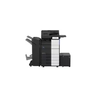
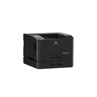
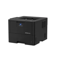
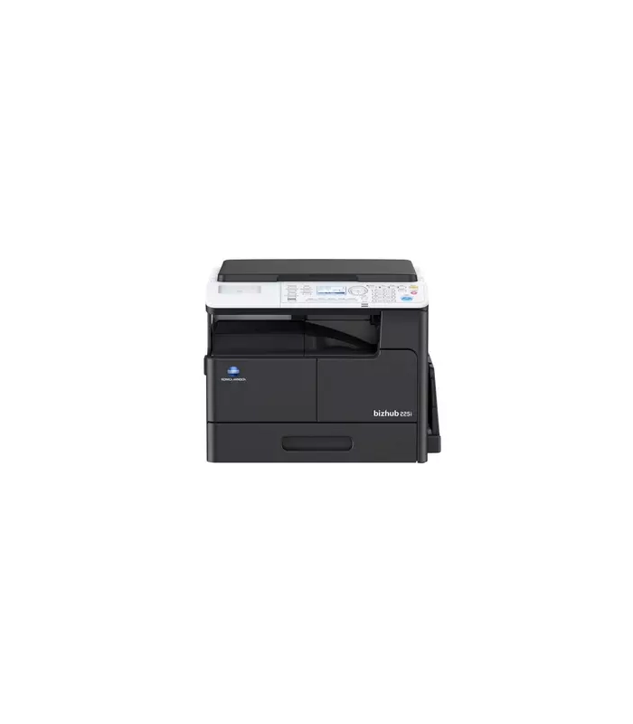
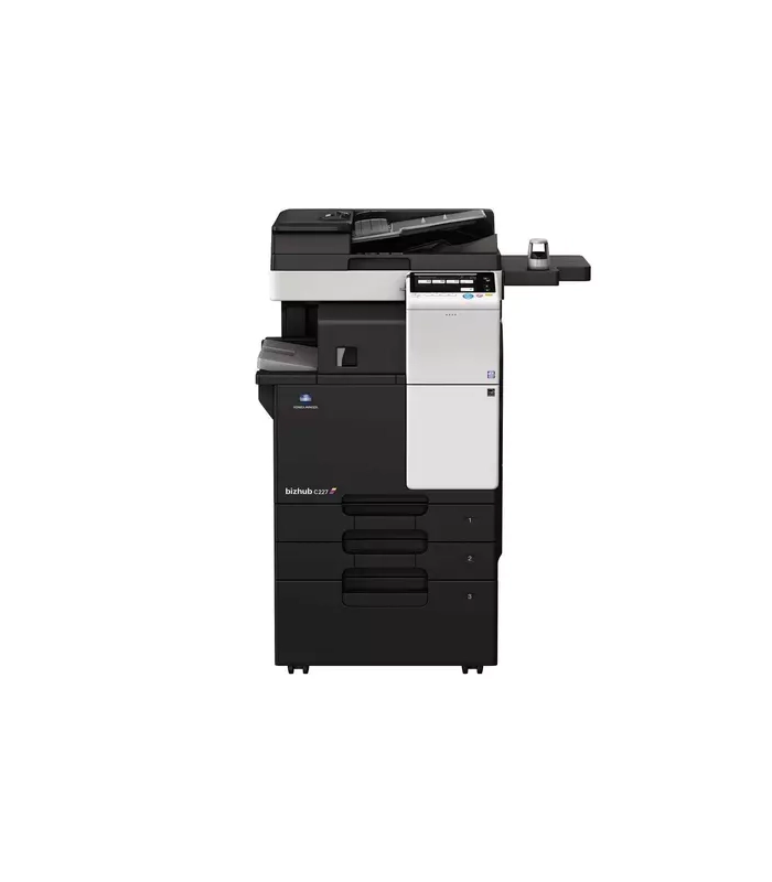
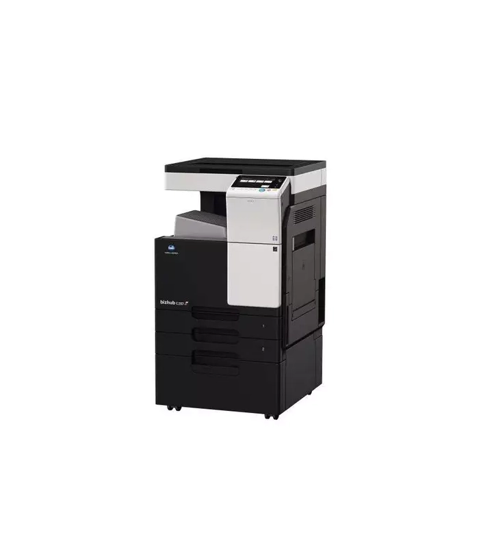
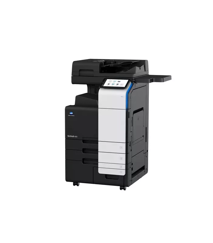
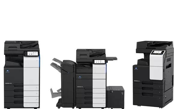
Комплексное решение-кликовый проект: Присоединяйтесь к Нашей Команде для Инноваций и Эффективности!
Мы предлагаем захватывающее комплексное решение-кликовый проект, который объединит профессионалов для совместн...
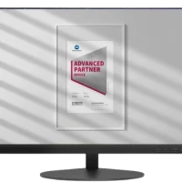
Промопрограмма Для партнеров
Промопрограмма Для партнеров
Условия программы
Для кого
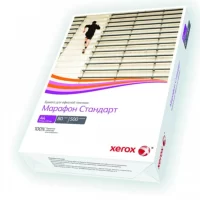
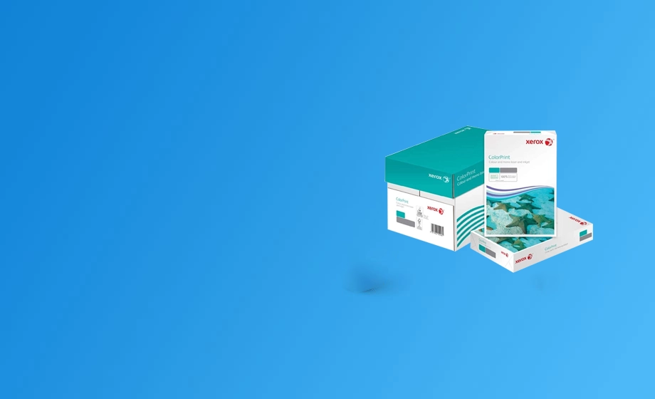
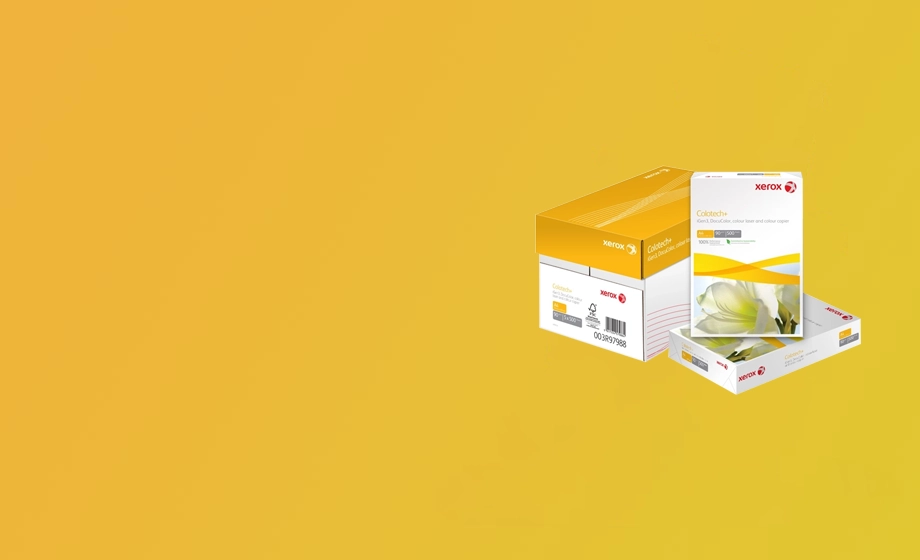
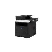
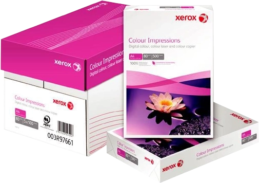
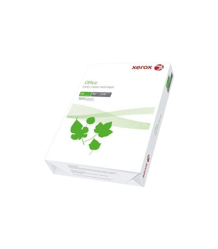
Особенности бумаги Xerox Marathon
Бумага Xerox Marathon имеет несколько особенностей, которые делают ее одной из лучших в ...
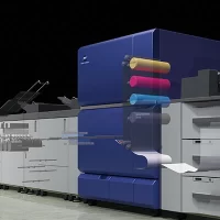
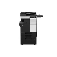
Комплексное решение-кликовый проект: Присоединяйтесь к Нашей Команде для Инноваций и Эффективности!
body.kc-css-system .kc-css-34932 ,body.kc-css-system .kc-css-34932 p{font-size: 16px;font-weight: 800;}body.kc...